Home > News > Company News
A bottle-shaped LED display is very different from a normal rectangular LED screen. You cannot simply create a 1920 × 1080 video, upload it, and expect it to look correct.
The narrow neck, curved shoulder, wide body, and 360-degree viewing surface all affect how an image appears. A logo that looks perfect on a computer may become stretched around the bottle. Small text may disappear around the neck, while an animation may show an obvious seam where the two ends of the content meet.
For this reason, good bottle-shaped LED display content should be designed according to the real shape and pixel layout of the screen.
This guide explains a practical way to do it.
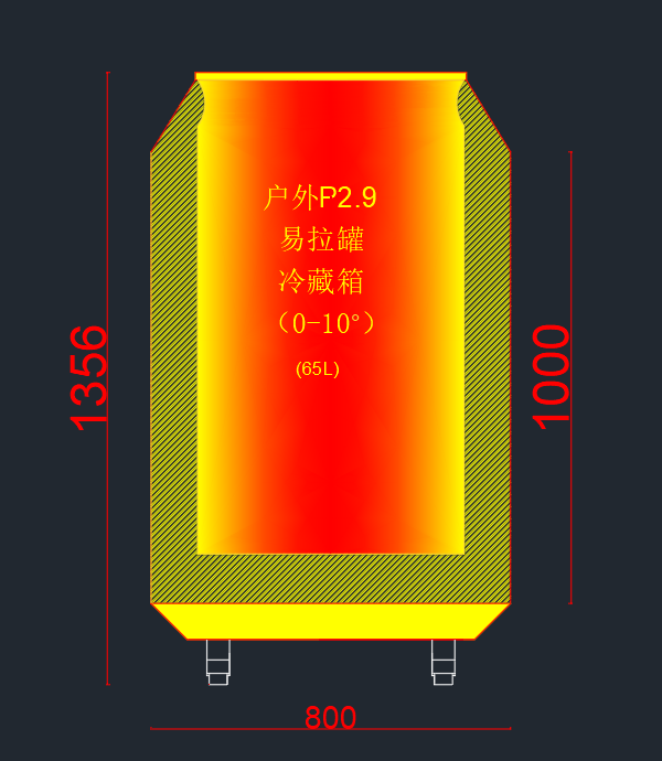
Before creating graphics or animations, get the exact screen specifications from the LED display manufacturer.
Important information includes:
Do not automatically design the video in standard 16:9 resolution.
A customized wine bottle LED screen may use different pixel pitches and dimensions depending on its size and viewing distance. The content canvas should therefore match the actual LED mapping rather than a standard video format.
This is one of the most important steps because incorrect resolution can make logos, text, circles, and product images look soft or distorted.
A useful way to design content is to divide the bottle into several visual areas.
The cap is usually a very small display area.
Simple effects work best here:
Avoid detailed text or complex images.
The neck is narrow and normally has fewer horizontal pixels.
Vertical animations, moving lines, bubbles, light trails, or simple brand elements are better choices.
Long horizontal text should be avoided because it may wrap too far around the bottle.
The shoulder is one of the most difficult areas.
The diameter changes as the bottle moves from the narrow neck toward the wider body. This means detailed graphics may appear compressed or stretched if the content is not mapped correctly.
Avoid placing faces, QR codes, detailed logos, or important text directly across this transition.
Instead, use:
These effects can follow the bottle shape naturally.
This should normally be the main communication area.
It is suitable for:
If you have one important message, place it here.
One common mistake is spreading important information across the entire bottle.
Remember that customers usually see only part of a 360-degree display at one time.
For example, if a large logo wraps halfway around the bottle, a customer standing in front may see only part of it.
Instead, establish a clear safe area for important information.
Logos, product names, prices, and calls to action should remain visible from the primary viewing direction.
For installations where people walk around the display, the same logo or message can also appear several times around the circumference.
This makes the information easier to understand from different positions.
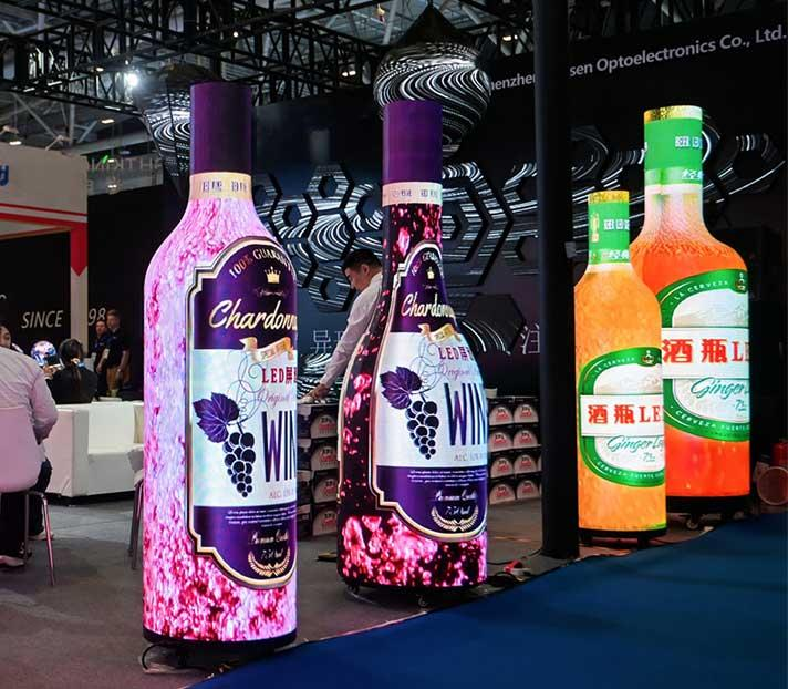
The biggest advantage of a bottle-shaped LED display is that the display becomes part of the product shape.
This also changes how content should be created.
Instead of thinking about one front-facing image, think about how the animation moves around the entire bottle.
Good effects include:
These effects use the shape instead of fighting against it.
For beverage advertising, for example, an animation could begin with bubbles rising from the bottom, followed by the brand color filling the bottle before the logo appears on the main body.
The bottle itself becomes part of the story.
A 360-degree animation has a starting point and an ending point.
When these two edges meet, they create a seam.
If the left side of the video is bright red while the right side is black, the transition can become obvious on the physical display.
A better approach is to design both edges so that they connect naturally.
Patterns, gradients, particles, waves, and flowing liquid are especially useful because they can cross the seam without creating an obvious break.
Before exporting the final video, check the first and last horizontal areas of the mapped content.
Bottle LED screens are often installed in retail stores, exhibitions, bars, shopping malls, hotels, and promotional events.
People may only look at the screen for a few seconds.
Therefore:
Short messages usually work better.
Instead of:
“Discover Our New Premium Wine Collection Available This Season”
try:
“Discover the New Collection”
or:
“Taste Something Different.”
Large fonts and strong contrast are easier to read, especially when text is moving around a curved surface.
Small paragraphs should generally be avoided.
Animations are more effective when their movement matches the physical structure.
For example:
Bottom → Top
Bubbles, liquid, flames, or light can rise from the bottle base toward the neck.
Top → Bottom
A pouring animation can move from the neck toward the main body.
Around the Bottle
Light trails, logos, ingredients, or decorative patterns can rotate around the circumference.
This creates a stronger connection between the physical bottle and the digital content.
It also makes the display feel less like a normal LED screen wrapped around an unusual structure.
Most bottle-shaped LED displays continuously repeat promotional content.
An obvious restart every five or ten seconds can make the screen look less professional.
The beginning and end of the animation should therefore connect smoothly.
For example, if bubbles rise continuously, the number and position of bubbles near the final frame should allow the animation to return naturally to its first frame.
The same principle applies to:
A clean seamless loop is especially useful for displays operating all day in stores or exhibitions.
A creative-shaped screen attracts attention because of its form.
You do not need to fill every pixel with information.
A simple sequence can be more effective:
Brand color → Product animation → Logo → Short message → Product effect → Loop
This gives viewers enough time to understand each visual.
Trying to show the company name, product features, website, phone number, QR code, slogan, price, and product images at the same time usually creates visual clutter.
Content should also change according to where the display is installed.
For close-view retail installations, fine details and smaller product information may work well.
For exhibitions, shopping mall atriums, events, or larger installations, viewers may stand several meters away. In this case, use:
Pixel pitch should also be selected according to screen size and expected viewing distance.
TOOSEN bottle and can-shaped LED solutions support different pixel pitches and customized dimensions for indoor and outdoor applications.
Computer previews are useful, but they cannot completely reproduce the appearance of a physical curved LED display.
Before final delivery, test the content on the actual screen whenever possible.
Check:
Walk around the display while the video is playing.
A graphic that looks correct from the front may appear very different from the side.
If something looks wrong, adjust the source content or mapping rather than simply accepting the distortion.
Several mistakes appear frequently when content originally designed for flat displays is used on creative LED shapes.
Using a standard 16:9 video without checking the pixel map:
The source content may be resized or mapped incorrectly.
Putting important text around the bottle neck:
The narrow area can reduce readability.
Placing logos across the bottle shoulder:
Changes in diameter may make the logo look distorted.
Ignoring the 360-degree seam:
The starting and ending edges of the animation may create a visible line.
Using too much text:
Curved displays are better for short visual communication.
Making animations too fast:
Viewers need enough time to recognize the brand and understand the message.
The best content depends on the application.
For wine and beverage brands, suitable ideas include vineyard scenes, flowing wine, bubbles, ingredient animations, brand logos, tasting notes, and seasonal campaigns.
Retail stores can use product launches, discounts, new-product announcements, and branded visual loops.
At exhibitions, a larger bottle-shaped screen can use bold logos, dramatic color transitions, product reveals, and synchronized animations to attract visitors from a distance.
Because the display itself resembles the product packaging, content and physical form can work together to create stronger brand recognition.
TOOSEN specializes in customized spherical and special-shaped LED displays, including wine bottle and can-shaped LED screens.
Bottle-shaped displays can be customized according to the required size, pixel pitch, structure, and application. Indoor and outdoor solutions are available, together with synchronous and asynchronous content control options.
For custom projects, content design should ideally begin together with screen engineering. Knowing the exact dimensions, pixel map, module arrangement, and control method before creating the final video can reduce content distortion and simplify installation and commissioning.
Explore TOOSEN Wine Bottle LED Displays
Designing content for a bottle-shaped LED display is not simply about resizing a normal advertising video.
The physical shape must become part of the design process.
Start with the real pixel map, divide the bottle into visual zones, protect important content with safe areas, account for the changing diameter, and create animations that work naturally across a 360-degree surface.
Most importantly, test the final content on the physical display.
When the screen structure, pixel mapping, and animation are designed together, a bottle-shaped LED screen can turn familiar product packaging into a dynamic digital advertising experience.
Use the actual pixel resolution and mapping provided for the LED screen instead of automatically using 1920 × 1080. Customized bottle displays may have very different pixel layouts.
Yes, common video formats can be used through the appropriate LED control system, but the visual content should first be prepared according to the screen's resolution and mapping.
 EN
EN
 AR
AR
 BG
BG
 HR
HR
 CS
CS
 DA
DA
 NL
NL
 FI
FI
 FR
FR
 DE
DE
 EL
EL
 HI
HI
 IT
IT
 JA
JA
 KO
KO
 NO
NO
 PL
PL
 PT
PT
 RO
RO
 RU
RU
 ES
ES
 SV
SV
 TL
TL
 ID
ID
 SR
SR
 UK
UK
 VI
VI
 ET
ET
 HU
HU
 TH
TH
 TR
TR
 FA
FA
 AF
AF
 MS
MS
 GA
GA
 HY
HY
 AZ
AZ
 MN
MN
 UZ
UZ